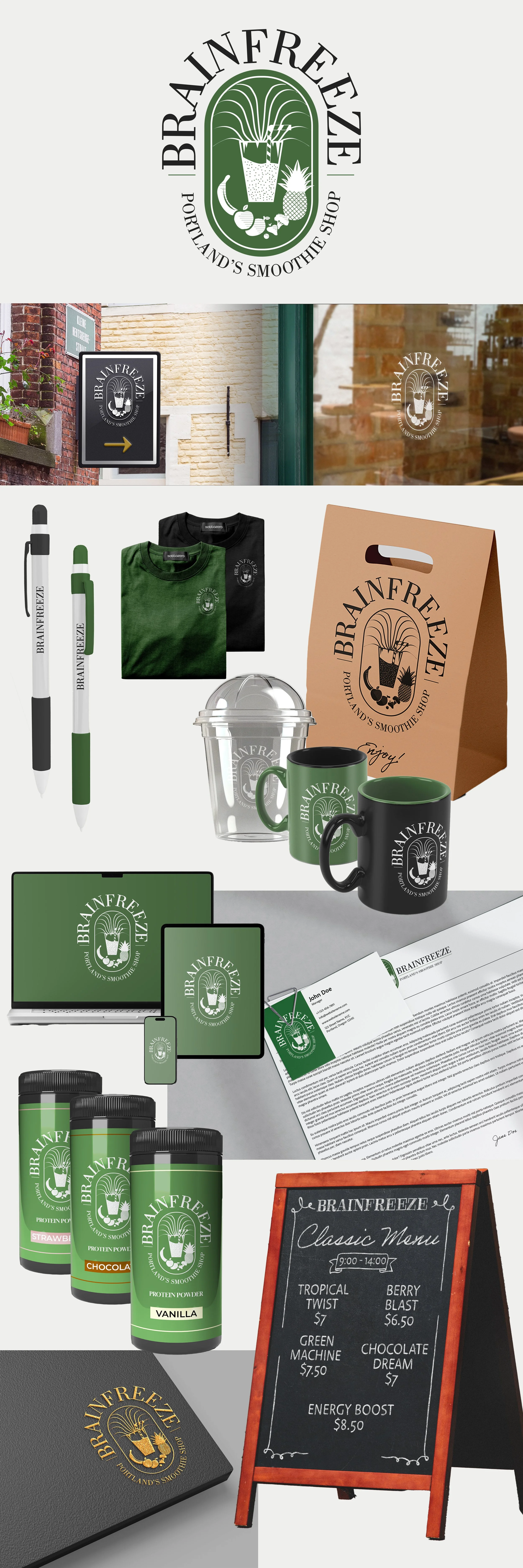
Brainfreeze Branding + Collateral Design
Need a fresh smoothie in the beautiful city of Portland, Oregon? Brainfreeze has your back!
Here’s how this brand’s look and feel came to be!
Background
This was a project I worked on for an entire semester; basically, in class, we were each given a random, made-up business that we were supposed to focus our branding efforts on. Some students got some music business, while others got a sports-based business. I got a smoothie business named Brainfreeze, which was located in Portland, Oregon. At the time, this turned out to be a new kind of project for me, as we were to focus on this business for the entirety of the semester. We had to not only make the logo itself, but create animations involving it, mockups, among others. I started off with some research. What kind of “vibe” do smoothie shops often give?
Okay. Lots of wholesomeness here. Green and white tends to be often used with smoothie shops, as well as either very rounded, lower-case fonts or capital sans-serif fonts. From here, I went to the sketching board and tried different ideas that replicated this style.
I like some of these ideas! Let’s try going digital. Since I lean towards more minimalist shapes, that’s what I started off with. A simple wavy line is kind of reminiscent of a blender. You can also see me messing with the shapes and seeing what worked and what didn’t. Eventually I decided to get out of my comfort zone and try more advanced illustrations and serif fonts.
I really liked the oval illustration with the smoothie and the fruits! We can use the serif font to give a vintage vibe that stands out from all the modern minimalist logos we’ve been seeing. I tried experimenting with color as well. Ultimately, I decided to go with a darker green.
The Finished Product
And voila! We got ourselves a solid logo that the business can use. From here, I was able to go the extra mile and make animations based on the logo, as well as make some mockups using the logo.

What I Learned
There’s a lot more work to logo design than people initially think. There are a lot of decisions the designer has to make; what kind of business are you designing for? What do they value? How can we make their brand memorable? When these aspects are considered, the brand can really show their style through a memorable logo.
This is the project that got me a lot more in-depth in the brainstorming process. Before this, I was sticking with what was “safe” and the things I’ve known. However, starting with this project, I played outside of my comfort zone a lot more, which allowed me to come up with a solution that was not typical of what I usually come up with.
I was able to get more experience making mockups using Photoshop! The mockups I made were great at helping the brand come to life, and the consumer can get a clearer idea of what the branding looks like in action. It also gave me a greater sense of where you would most likely find the branding in various situations.


